Just a few pics of my dh removing the vanity. We did have plans to save the sink and toilet and donate it to the local habitat for humanity store, but sadly the sink was chipped quite badly when dh removed the vantity top, we have managed to save the toilet and the light fixture so we will drop them off some time soon. More pics of the before can be seen here


So here is my dh doing a little bit of demolition, what fun that was, you know that moment you get when you think what are we doing? well this is that moment for me, especially when the vanity unit was removed and we found out it had not been tiled all the way to the wall, this could have been a complete disaster but lucky enough there were some tiles in the basement that matched. So all it meant was we were going to have to do a little bit of tiling, so off we went to Menards to get some tile grout and adhesive and a tile cutter. It all worked out OK in the end

So here it is, our new bathroom all finished. I am really pleased with the result. This is the new changes we made:
WHITE Toilet Menards
vanity unit,
WHITE Toilet Menards
vanity unit,
silver knobs Menards
white vanity top.sink Menards
Taps (faucets)
Skirting boards (I think these are called baseboards in the US)
Mirror from TJ Maxx
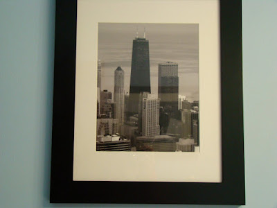
Artwork prints black and white and matted
Light fixture from Menards
Toilet roll holder
Towel rail
Light switches and sockets changed from cream to white with new brushed silver backplates
Basket TJ Maxx
I took these photos a couple of years ago, but never had anywhere that I really wanted to put the. So when we could not find any artwork we liked to put in the bathroom I decided to convert these pictures to B&W.


Just for fun here is a before and after shot side by side;
BEFORE AFTER


I have posted this on the link party over at My uncommon slice of suburbia


Hi Sam! This looks fantastic. I really like the color you chose for the wall. And I even think the toilet paper basket is cute! I might have to try that one!
ReplyDeleteI love it! the color is perfect!
ReplyDeleteAmanda
blog designer
www.amanduhdesigns.com
That’s a gorgeous shade of blue you chose! And I think you paired it with the perfect shade of brown. And, that lighting fixture above the sink is really quite elegant as well. This is a very modern and contemporary bathroom style, which is something I am quite partial to. Great job!
ReplyDelete~ Leeanne Dyson